Tue Jan 02 2024
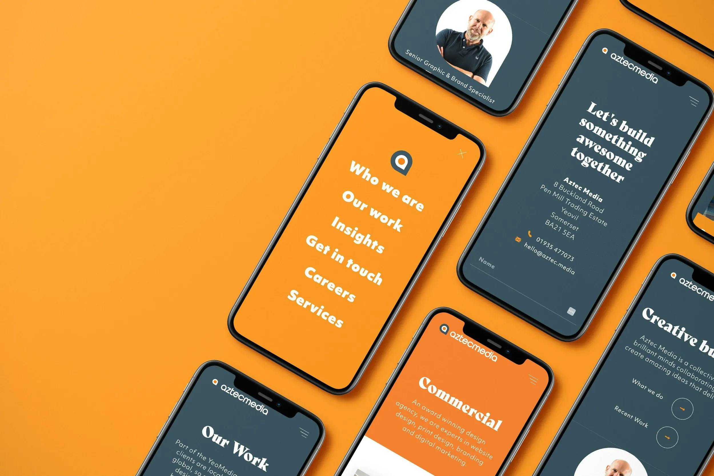
Crafting a User-Friendly Bespoke Website with Aztec Media
In the digital landscape, user-friendliness is the key to capturing and retaining the attention of your online audience. At Aztec Media, we believe that a user-friendly website is not just about aesthetics but also about providing an intuitive and satisfying experience. Let's explore four fundamental elements that contribute to making your website seamlessly user-friendly.
1. Maintain Consistency in Design:
Consistency is the linchpin of a user-friendly website. Ensure that your design elements—colour schemes, fonts, buttons, and overall aesthetics—remain consistent across all pages. This visual harmony creates a cohesive and professional appearance, fostering a sense of reliability and familiarity for users as they navigate through your site.
Tip: Establish a style guide that outlines design elements and guidelines for maintaining consistency throughout your website.
2. Have a Mobile-Friendly Navigation:
With the prevalence of mobile devices, a mobile-friendly navigation system is paramount. Design your navigation to be responsive, intuitive, and easy to use on various screen sizes. Implement a clear menu structure, and easy-to-click buttons, and ensure that users can effortlessly access essential information, regardless of the device they're using.
Tip: Test your website on different devices to ensure a seamless and user-friendly experience across various screen sizes.
3. Keep Titles Concise and Descriptive:
Clarity in communication is crucial for user engagement. Keep page titles, headings, and labels concise and descriptive. Users should quickly understand the content and purpose of each section or page. Clear titles enhance the overall user experience by guiding visitors to the information they seek without unnecessary confusion.
Tip: Craft titles that provide a snapshot of the content, enabling users to determine relevance at a glance.
4. Create a Clear Hierarchy of Content:
Organise your content with a clear hierarchy, placing the most important information prominently and logically. Utilise headings, subheadings, and visual cues to guide users through the content hierarchy. A well-defined structure improves readability, helps users navigate seamlessly, and ensures they find relevant information quickly.
Tip: Prioritise content based on user needs and create a logical flow that guides users through the desired journey on your website.
In conclusion, a user-friendly website is a harmonious blend of design consistency, mobile-friendly navigation, concise titles, and a clear content hierarchy. By focusing on these elements, you can create an online space that not only captivates your audience but also provides a positive and memorable user experience. At Aztec Media, we're committed to helping you achieve digital excellence and user satisfaction. Explore our insights and elevate your website's user-friendliness today.
View All InsightsAztec Media's 30th Birthday!
Why Image Optimisation is Important
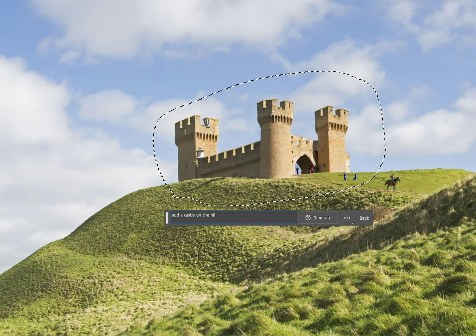
Exploring the Power of the New Photoshop AI Tool
The Importance of Keeping Your Google Business Profile Up-to-Date
5 Printed Media Ideas To Help Increase Sales
Creating an SEO Strategy for the Best Results in 2023
Aztec Media launch new website
Waterscapes rises above the competition with a new website
Aztec Media welcomes a new apprentice